Google Rolls Out Redesigned Workspace App Icons
▼ Summary
– Google Workspace app icons are now widely rolling out with a redesigned gradient look, fading from lighter to darker shades.
– The new gradient design is similar to the updated Google logo that launched a year ago.
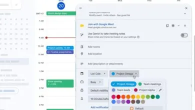
– Some icons, such as Google Chat, Meet, and Calendar, switched from a rainbow design to a single color.
– The single-color change could make the icons stand out more from one another or harder to recognize.
– The redesign was leaked last month and is now being implemented across the apps.
If your Google Workspace apps look a little different today, you’re not imagining things. A major redesign of the Google Workspace app icons is now rolling out to users, following a leak last month that hinted at the shift. As of this morning, many users are seeing the update, which introduces a gradient color scheme that transitions from lighter to darker tones, replacing the previous flat, uniform look. This change mirrors the redesigned Google logo that debuted about a year ago.
The new icons bring notable adjustments to several core apps. For instance, Google Chat, Meet, and Calendar have moved away from the classic rainbow palette to single-color designs. This shift could help each app stand out more clearly on your home screen, though some users might find the new look less immediately recognizable. Other icons, such as Gmail, Docs, and Sheets, have retained their familiar colors but now feature the gradient effect for a more cohesive visual identity across the suite.
As the rollout continues, Workspace users can expect a refreshed, modern aesthetic that aligns with Google’s broader design language. Whether you appreciate the streamlined simplicity or miss the old rainbow accents, the change is now live for many.
(Source: The Verge)