Google’s gradient icon design expands to more apps
▼ Summary
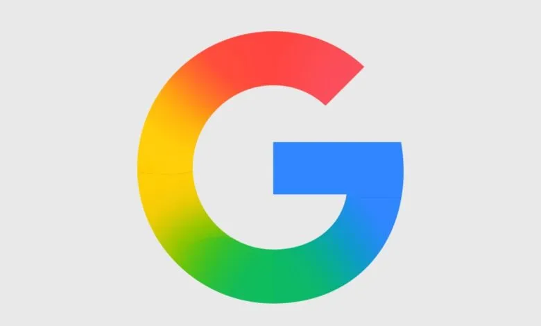
– Google is updating app icons with a softer, gradient design, moving away from the flat, uniform circle style that included all Google logo colors.
– The new icons feature rounder corners and pastel-to-saturated color transitions, and have already appeared in Google G, Gemini, Photos, and Maps.
– The redesign reflects recent trends away from flat design, with many apps (like Sheets and Slides) switching from portrait to landscape layouts.
– Most icons are more visually distinct and single-color focused, such as Chat’s green blob with a smile, though the Keep icon is criticized as poor.
– The rollout timeline for the new icons is unclear, but it is expected to occur soon.
In late 2025, Google began introducing a fresh gradient icon design across its app suite, and now it appears the update is expanding to the remaining services. 9to5Google obtained images of the new icons, which abandon the uniform circular approach that previously packed in every color from the Google logo.
The overall aesthetic is noticeably softer. Corners are rounder, and the gradients shift gently from near-pastel tones to the more vivid Google primary colors. We have already seen this new design language applied to the updated Google G logo, as well as Gemini, Photos, and Maps. According to 9to5, this shift signals the integration of AI-powered features across the ecosystem.
These icons feel more playful, vibrant, and varied, reflecting a broader design trend that has moved away from the flat, minimalist look of the late 2010s and early 2020s. Apps like Sheets, Slides, Forms, Sites, and Keep all drop the portrait-oriented sheet of paper motif. Many now adopt a landscape layout, which makes far more sense. After all, when was the last time you saw a vertical PowerPoint presentation?
Most of the icons feel like an improvement. They are more visually distinct and often embrace a single color. For example, Chat trades its four-color speech bubble outline for a green blob with a smile inside, a look reminiscent of the old Google Hangouts icon. The one exception is Keep, which, in my personal opinion, looks like hot trash.
It is unclear exactly when the new icons will begin rolling out to users, but the launch is likely coming sooner rather than later.
(Source: The Verge)