The Verge Launches Redesigned Homepage
▼ Summary
– The Verge’s homepage update aims to better serve its diverse audience by separating its content into two distinct modes: a curated section for top stories and an uninterrupted chronological feed.
– On desktop, the left side now features highlighted top stories and thematic story sets, while the right side maintains a pure reverse-chronological feed of all content.
– The redesign addresses a prior issue where important stories could be missed due to fast-moving feeds or limited space in top story sections.
– The Verge is establishing a user research group and a product updates page to involve readers directly in future development and testing.
– Beyond the homepage, the company plans to introduce features like dark mode, launch an app, and experiment with federation in the coming year.
The digital media landscape has transformed dramatically since The Verge’s last major homepage redesign in 2022. The decline of major social platforms, the rapid ascent of artificial intelligence, and fundamental shifts in news consumption habits have all reshaped how audiences connect with journalism. Through these changes, a core insight emerged: our readers are not a single entity with uniform habits. Some visit the homepage daily, while others engage primarily through RSS feeds or newsletters. This diversity meant our previous, fixed homepage struggled to serve everyone effectively.
A significant challenge was visibility. In a reverse chronological feed, impactful stories could scroll away too quickly. Pinning articles disrupted the stream’s natural flow, while competition for limited “top story” slots meant some of our best reporting was easy to miss. This update represents a deliberate effort to better balance our dual identity as both a curated magazine and a real-time news source.
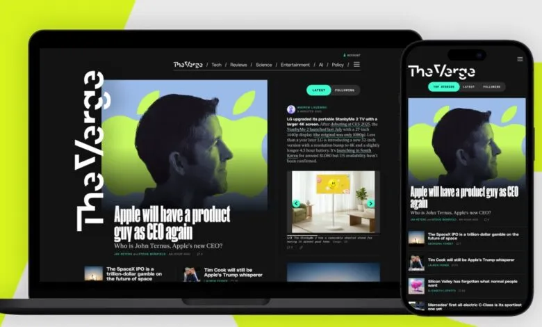
On desktop, this balance is achieved through a clear visual separation. The left column is now dedicated to curated editorial highlights. This area features the day’s top stories, followed by story sets which are thematic collections of articles. These sets might revolve around a major news event, a live update, or a deep-dive package, giving substantial work the prominence and longevity it deserves.
The chronological news feed remains essential, now residing uninterrupted on the right side of the page. This stream presents every published article and Quick Post in strict order, free from pins or algorithmic reordering. A toggle still provides access to the Following feed, populated by updates from a user’s chosen topics and authors. We continue to feature dynamic modules like Most Popular and Most Discussed stories, alongside the latest from our core coverage areas such as technology and product reviews.
On mobile, these two distinct modes translate into toggleable feeds at the top of the screen, offering the same flexible reading experience. The goal is to empower readers to seamlessly switch between seeing what our editors believe is most important and diving into the complete firehose of content to find what matters most to them personally.
This launch is just a starting point. We have established a dedicated product updates page to chronicle our development process and have formed a user research group to gather direct reader feedback. We tested early concepts for this homepage with that group, and we intend to continue this collaborative, iterative approach. We envision future features like customizable default landing views for logged-in users or visual cues for read articles to streamline discovery.
We acknowledge this design won’t solve every user’s needs instantly. It is intentionally shorter than its predecessor, as we plan to evolve and add to it based on what we learn. Furthermore, our product roadmap extends well beyond the homepage, with active development on long-requested features like dark mode, a dedicated mobile app, and experiments with platform federation.
Rethinking a core digital experience requires a concerted effort across multiple disciplines. This project was driven by The Verge’s product team, with crucial contributions from editorial, audience, art and design, and support staff, in close partnership with teams across Vox Media. Our foundational mission persists: to ensure The Verge is consistently engaging and enjoyable to read. We believe working transparently and in direct partnership with our audience is the surest path to that goal.
(Source: The Verge)