Why You Should Switch to Vertical Browser Tabs
▼ Summary
– Chrome is introducing a new reading mode that removes distracting website elements to improve readability.
– The browser is also adding a vertical tabs feature, which moves tabs into a sidebar on the left side of the window.
– Vertical tabs save valuable vertical screen space, which is more limited on widescreen displays than horizontal space.
– This layout makes managing many tabs easier by displaying more of their full titles at once.
– The design aligns Chrome with many modern apps that use a left sidebar for navigation, creating a more consistent user experience.
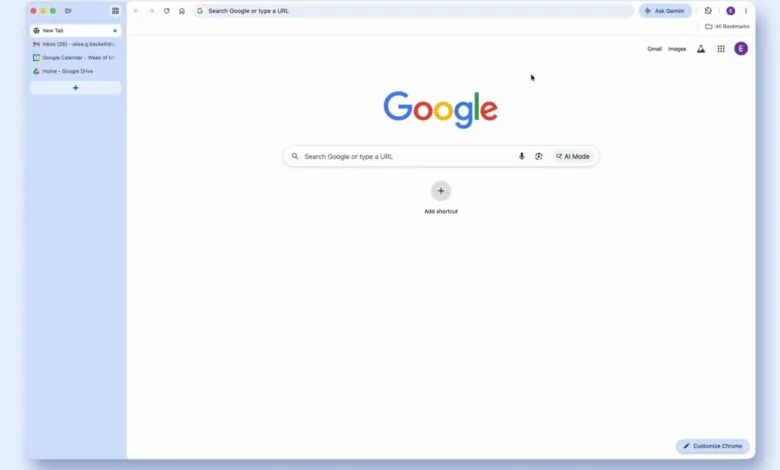
Google Chrome has finally introduced a long-awaited feature that fundamentally improves how we manage multiple web pages: vertical tabs. This update, which moves your open tabs into a sidebar, is more than a simple layout change. It represents a smarter use of screen space on modern widescreen displays, where vertical real estate is often more valuable than horizontal space. The feature is easy to activate by right-clicking the tab bar and selecting the new option, and its benefits are immediate.
The concept isn’t new. Even Chrome’s original design team experimented with vertical tabs before settling on the horizontal bar we’ve used for years. Their reasoning was that tabs at the top felt more like distinct application windows. While that logic persisted, the digital workspace has evolved. Today’s widescreen monitors are perfectly suited for a sidebar layout, freeing up crucial vertical room for the actual content of websites and web apps.
Chrome’s implementation is effective. When enabled, the address bar shifts to the top row, creating a cleaner interface that occupies less space. For true minimalists, the sidebar can be collapsed to show only website favicons, making the browser’s interface nearly disappear. While some competing browsers have integrated the address bar and bookmarks into a more unified sidebar, Chrome’s focused approach still delivers a significant upgrade in organization and screen management.
The primary advantage is practical. On a standard laptop, a dozen horizontal tabs become an unreadable strip of truncated titles. With vertical tab management, you can see the full title of over twenty tabs at once, making it effortless to locate a specific document or article. This eliminates the frustrating guesswork of hunting through identical icons. It also enhances the utility of tab groups, allowing them to expand and collapse neatly within the sidebar without disrupting your workflow.
This shift also aligns the browser with the design language of modern software. From productivity tools like Notion and Slack to creative platforms like Canva, the left-hand sidebar has become a standard navigation paradigm. Since browsers are now the primary gateway to these web applications, it’s logical for them to adopt a similar, familiar structure. While some major office suites still use top-mounted toolbars, the sidebar approach is widely recognized for its efficiency.
The best part is the lack of commitment required. You don’t need to switch browsers to experience the improvement. Simply update Chrome, try the vertical tab view for a few minutes, and judge the difference for yourself. The enhanced clarity and the recovery of precious screen space are compelling reasons to make the change permanent.
(Source: The Verge)