Marathon’s Aesthetic Sparks ‘Fontslop’ Debate as Bungie Stands Firm

▼ Summary
– Following a recent beta test, significant player feedback has criticized the visual design and readability of Marathon’s in-game menus, with some dubbing it “fontslop.”
– Critics, including prominent content creators, specifically cite an overwhelming mix of fonts, sizes, and styles that make menus difficult to navigate and an “eyesore.”
– However, some players defend the game’s bold and abstract aesthetic, viewing it as a visually ambitious departure from standard video game design.
– Marathon’s UI designer acknowledged the feedback, stating the team will work on improving areas like navigation and information density based on player input.
– The designer also made clear that the team intends to preserve the distinctive, stylized “sauce” of the user interface despite the criticism.
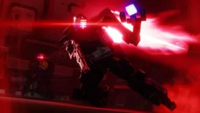
The recent Marathon Server Slam has ignited a passionate debate among players, with a central point of contention being the game’s user interface and its distinct visual design. Feedback from the test weekend has been extensive, with many participants highlighting challenges related to menu readability and information clarity. This specific critique has been encapsulated in a term that has quickly gained traction online: ‘Fontslop’.
The term was popularized by content creator Kelski, who shared an image of the game’s contracts page. They criticized the apparent lack of visual consistency, pointing to what they perceived as an excessive mix of fonts, weights, sizes, and text formatting all competing for attention on a single screen. This sentiment found a strong echo with other players, including prominent streamer Ninja, who remarked that Marathon featured some of the most complex menus he had ever encountered. For these critics, the bold artistic choices have created a confusing and visually overwhelming experience that hampers navigation and gameplay.
However, this perspective is not universal. A vocal contingent of players and commentators have come to the defense of Marathon’s aesthetic direction. They argue that the UI represents a daring and refreshing departure from the standardized, minimalist interfaces that dominate modern gaming. These supporters view the design as a creative and intentional artistic statement, praising Bungie for taking a risk with a more abstract and stylized approach. They suggest that the initial confusion is a small price to pay for a unique and memorable visual identity.
The discussion moved beyond mere fan debate when Elliot Gray, Marathon’s lead UI designer, directly addressed the feedback. In a notable move, he humorously added ‘fontslop merchant’ to his social media profile before offering a substantive response. Gray acknowledged that the development team is actively reviewing player concerns regarding practical elements like inventory management and information density, and he confirmed that adjustments would be made in these areas based on the feedback.
Yet, he also issued a clear and definitive statement regarding the core artistic vision. Gray firmly stated that while the team is committed to improving usability, they have no intention of dialing back the distinctive style and personality, what he called the “SAUCE”, of the user interface. This indicates that Bungie aims to find a balance, refining functional aspects while preserving the game’s bold and unconventional aesthetic that has sparked such divided reactions. The outcome of this effort will be closely watched as Marathon continues its development.
(Source: EuroGamer)