Google Pixel’s Android 17 UI Gets New Blur Effect
▼ Summary
– Google is introducing significantly more blur effects across the system UI in Android 17, continuing its visual design updates from the previous year.
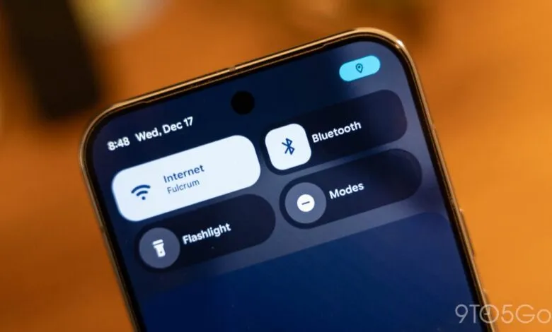
– This blur effect makes backgrounds translucent, allowing users to see content behind system components like the volume bar, power menu, and homescreen.
– The blur is tinted by the user’s Dynamic Color theme, but Android 17 is a smaller visual update compared to last year’s major overhaul.
– Google first introduced subtle blur to notification panels in Android 16 to create a sense of depth and maintain background app awareness.
– It remains unclear if this translucency will be extended to apps via Material 3 Expressive or reserved solely for the operating system.
Google’s upcoming Android 17 update is set to enhance the user interface with a more widespread and sophisticated use of blur effects, building upon the visual foundation laid by last year’s Material 3 redesign. This evolution focuses on adding depth and translucency to key system components, creating a more layered and modern aesthetic.
Internal builds and system flags explicitly referencing “blur” reveal a consistent design direction. The operating system will transition numerous elements from solid backgrounds to translucent, blurred overlays. This allows the content behind active UI components, like your wallpaper or an open app, to remain subtly visible. For instance, the volume control panel will appear as a pill-shaped container where the background softly shows through. The same treatment is expected for the full volume sheet and power menus, integrating these controls more seamlessly with the active screen environment.
These new blur effects will be intelligently tinted to match your selected Dynamic Color theme, ensuring visual harmony. It’s important to note that Android 17 is not a complete visual overhaul like its predecessor. The core interface will retain its familiar structure and functionality, with these blur enhancements serving as a refinement rather than a revolution.
This initiative continues the work begun in Android 16, where Google first introduced subtle blur to the notification shade and Quick Settings panel. The stated goal was to provide a “sense of depth” and make system interactions feel “lightweight” while keeping users aware of background apps. Compared to the pronounced “Liquid Glass” effect seen in iOS, Android’s implementation aims for a more restrained and subtle approach to translucency.
Currently, this blur effect is not a defined part of the Material 3 Expressive guidelines for third-party app developers. A key question remains whether Google will keep this visual treatment exclusive to the system interface or eventually extend similar design principles to encourage a more cohesive look across the entire app ecosystem.
(Source: 9to5 Google)