Google introduces bold gradient icons for Gmail, Calendar, and Drive
▼ Summary
– All Google Workspace apps are receiving a gradient redesign to reflect AI-powered features, moving away from the previous mandate of including all four company colors.
– The new icons are more distinct in color and shape, with the page container removed for most apps to allow for larger, more unique designs.
– Google Drive now uses only green, yellow, and blue, while editor apps Docs, Sheets, and Slides each use a single predominant color with Sheets and Slides switching to a landscape orientation.
– Google Meet adopts a yellow video camera icon, and Google Chat features a green, pill-shaped message bubble with a smile, referencing Hangouts.
– Gmail retains the ‘M’ envelope shape but with a more rounded design and red as the predominant color, making it the only new icon to use all four Google colors.
Google is rolling out a sweeping visual refresh for its Workspace apps, and the changes are anything but subtle. Following the gradient updates already applied to the Google ‘G,’ Gemini, Home, Photos, and Maps, the company is now extending the same treatment to Gmail, Calendar, and Drive in what amounts to a complete redesign of the icon set.
The overarching goal is twofold: first, to visually signal the integration of AI-powered features through a consistent gradient effect, and second, to address long-standing user complaints about icon confusion. The previous mandate that forced every icon to include all four Google colors has been abandoned. Instead, the company is stripping away the page container from most apps, allowing for larger, more distinct shapes and a clearer color palette.
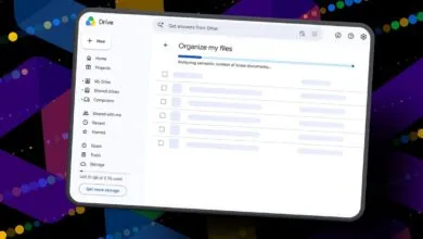
Google Drive leads the charge with a dramatic simplification. The red is gone. What remains is a triad of green, yellow, and blue, matching the three core editor apps. The outer shape is a heavily rounded triangle, almost bulbous in appearance, but it frames a sharp, precise triangle at its center.
Google Docs, Sheets, and Slides retain their single-color identities, but with a clever twist. The Docs icon stays as a vertical piece of paper, while Sheets and Slides have switched to a landscape orientation, a subtle but smart nod to the actual layout of the applications.
Google Meet takes the biggest leap. The video camera shape remains, but the predominant color is now yellow. The reasoning behind that choice isn’t immediately clear, but it’s a massive departure from the current blue. Google Chat sees a similar overhaul, adopting a pill-shaped message bubble with a friendly smile, colored green as an apparent homage to the now-defunct Hangouts.
Gmail is the most conservative of the bunch. The iconic ‘M’ envelope is still there, just slightly more rounded. Crucially, red remains the dominant color, with only small accents of yellow, green, and blue. Of all the new icons, Gmail is the only one that still uses all four Google colors, and it is the right call, making the icon instantly recognizable.
Google Calendar is a welcome throwback. It returns to a skeuomorphic flip-style design, ditching the four-color exterior container for a classic, solid blue. It feels like a deliberate return to an older, more beloved aesthetic.
Google Tasks keeps the checkmark, but the surrounding container is less obvious. It now resembles a button you might tap to complete a reminder, with blue as the primary color. Google Keep has removed the page background entirely, focusing all attention on a highly detailed light bulb. Google Voice retains its phone shape but rounds everything off, using a light green that matches Chat, reflecting its focus on business calling.
Google Forms drops the paper motif for multiple choice bubbles while keeping purple as the main color. Google Sites, meanwhile, shifts from a dark blue to a lighter one, with the horizontal orientation now reflecting the desktop web experience.
This gradient redesign is more than just a visual polish. It’s a strategic move to unify the brand around AI while making each app’s icon more distinct and functional in a crowded user interface.
(Source: 9to5google.com)