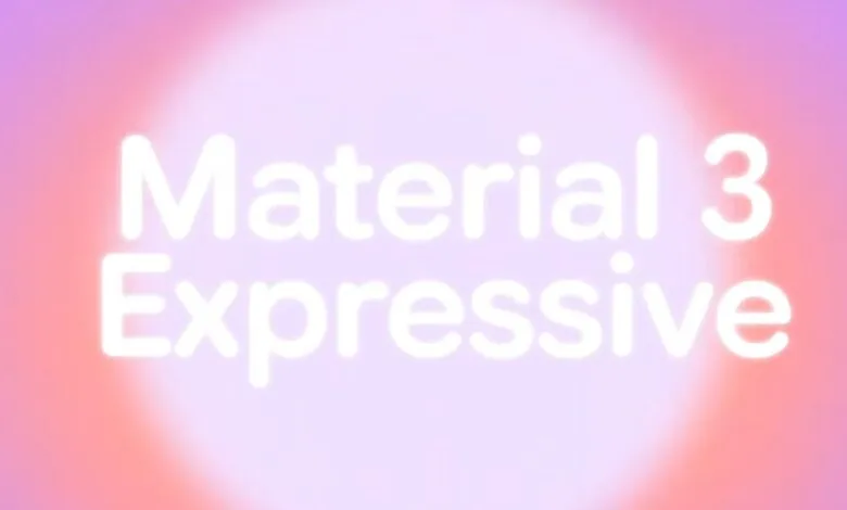
Android’s Expressive UI: Material Design 3.5 App Recap
▼ Summary
– Both Apple and Google are planning major design overhauls for their operating systems in 2025, with Google’s update being the Material 3 Expressive redesign for Android.
– While Material 3 Expressive is a successful, unifying redesign for the Android system itself, its implementation in Google’s first-party apps feels like an incremental update, more akin to Material 3.5.
– The redesign introduces inconsistencies, such as a modified search bar that disrupts universal component design and a reversion to a short bottom navigation bar without clear benefit.
– Specific design changes, like overly large buttons and excessive use of containers, can make interfaces feel cluttered or disproportionate, despite some usability improvements.
– Ultimately, the update does not significantly change how users interact with Google apps or make them feel more cohesive and engaging, representing a missed opportunity for a truly expressive overhaul.
It’s interesting to see both Apple and Google planning major design overhauls for their operating systems in 2025. Android’s Material 3 Expressive redesign has been widely praised for its cohesive feel across phones, tablets, and watches, bringing a unified look to the system interface. Yet when we turn to Google’s own suite of applications, the update feels more like a cautious step forward than a bold leap.
This iteration is officially called Material 3 Expressive, not Material 4, which is a telling detail. It builds upon the foundation laid in 2021, aiming to inject more personality. In practice, it comes across as a substantial point-five upgrade rather than a full generational shift. The changes in Google’s apps are a mix of welcome modernizations and puzzling inconsistencies.
One of the most noticeable tweaks is the search app bar. The hamburger menu and profile switcher have moved outside a now-taller pill-shaped container. This creates a cleaner look in apps like Gmail, Drive, and Keep. However, the older design, which housed all elements within the search bar, offered a more universal and consistent component. The new approach creates fragmentation. The updated Contacts app can’t use this bar because it lacks a hamburger menu, while the Phone app has no profile switcher at all. While not every app needs to be identical, a stronger design framework around top-screen navigation would improve coherence.
Another shift is the return to a shorter bottom navigation bar, reversing the taller style of Material You. The rationale isn’t clear, as the reclaimed space doesn’t meaningfully increase content area. In fact, when Google TV adopted the shorter bar, the Library tab left the new space empty. This is puzzling given that M3 Expressive otherwise champions larger touch targets, evident in its expanded floating action buttons. The transition from tall to short bars is still underway across Google’s ecosystem.
Navigation also introduced a floating toolbar, seen in apps like Google Chat. This element is designed for context-specific actions, not primary app navigation, a role demonstrated in Google Photos albums. While the “Liquid Glass” visual effect is sleek, using it for navigation raises practical questions. Docking it to the bottom ultimately makes more sense, as it frees up screen real estate for actual content.
The design’s increased use of containers draws mixed reactions. On one hand, they enhance usability by clearly defining tappable areas. On the other, they can make interfaces feel cluttered and dense, particularly in list-heavy views. There’s a sense that some apps might be over-containerized. Google Drive, for instance, appeared to scale back its use of containers after an initial rollout.
Button sizing has also grown significantly. Larger touch targets, like the big FABs in Drive and Docs, are functional after an adjustment period. Yet, extra-large buttons in apps like Meet and Clock’s Stopwatch can appear disproportionate and even comical, disrupting the visual harmony of the interface.
Where the update truly shines is in motion. New physics-based animations make interactions feel fluid and alive. The pull-to-refresh in Google Photos is a standout, and loading indicators using M3E shapes are a fresh departure from simple spinners. The springy FAB menu in Google Docs feels great捻though the one in Drive feels cumbersome with its lengthy list of options.
Ultimately, the daily experience of using Google apps hasn’t been transformed by Material 3 Expressive. The system-level Android interface feels more dynamic, but app interoperability and cohesion haven’t meaningfully improved. The goal of expressive design is to evoke emotion and intuitively guide users, yet these app updates largely feel like straightforward component swaps. They achieve adoption of the new standard but stop short of reimagining core, aging interfaces from the ground up with true expressiveness. It’s a solid evolution, but the opportunity for a more engaging and unified application ecosystem feels partially missed.
(Source: 9to5 Google)