The Problem with AI’s Sparkly Star Symbol
▼ Summary
– While generative A.I. usage is widespread and growing, especially at work, surveys show most Americans and global citizens are more worried than excited about it and find it untrustworthy.
– The article proposes that public disappointment with A.I. stems not from hype or misleading ads, but from the ubiquitous “sparkle” icon used to signify A.I. features, which sets unrealistic magical expectations.
– Designers and academics acknowledge the sparkle icon is a deliberate metaphor for “magic,” intended to shape user perception toward seeing A.I. as a source of friendly, automated superintelligence and insight.
– Critics argue this magical, frictionless branding is problematic, as it lacks necessary warnings about potential misuse and dangers, unlike a warning symbol that would signal both excitement and risk.
– Despite some user confusion with a “favorite” star icon, the sparkle is gaining momentum as the industry’s standard A.I. symbol, with the potential to become as entrenched as the Wi-Fi icon, perpetuating its magical promise regardless of actual performance.
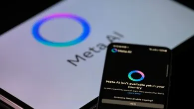
As 2025 draws to a close, a clear paradox defines the state of generative artificial intelligence in the United States. Widespread adoption coexists with deep-seated public skepticism. Platforms like ChatGPT, which topped app store charts this year, now see weekly use by over a billion people globally, with workplace integration accelerating rapidly. Yet, consistent polling reveals a population more apprehensive than enthusiastic. A significant majority, 68 percent according to one survey, express such distrust that they would refuse to let an AI act autonomously on their behalf.
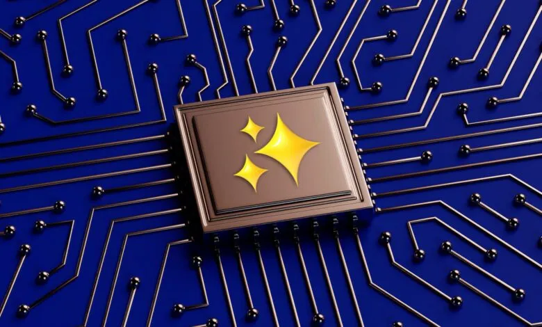
This pervasive sense of unease might stem from an unexpected source. Beyond the grandiose promises from tech leaders or the complex economic dependencies, a subtle visual cue may be shaping our fundamental perception of the technology. The ubiquitous symbol, a four-pointed star or stylized sparkle, has become the default icon for AI features across countless applications. This seemingly minor design choice carries profound implications for how we understand AI’s role and potential.
Google’s design teams appear to have pioneered this trend in the mid-2010s, well before the current competitive frenzy. Today, the sparkle is embedded in logos from Gemini to Adobe’s Firefly and appears on buttons within Zoom and Canva, often labeled with terms like “Magic Media.” The metaphor is intentional and potent. As one professor of user experience design explains, the sparkle evokes magic, a concept from myth and folklore that is not inherently positive but is often used to teach cautionary lessons. By selecting this imagery, companies actively shape user expectations, framing the technology as something wondrous and transcendent.
Industry insiders readily acknowledge this intent. A principal engineer for AI tools described the icon as needing to signal “superintelligence, that automation, that insight, that magic.” The symbol is gentle and ethereal, creating an open-ended promise that can apply equally to a helpful writing assistant or a tool capable of generating harmful deepfakes. It invites exploration without conveying the weight of responsibility, functioning as a friendly door to possibilities rather than a panel of necessary warnings.
This lack of friction or clear risk disclosure is a critical part of the design. User experience experts note that not every digital interaction should be seamless; some require deliberate friction for safety. Imagine if generative AI tools opened with prominent warnings against misuse for misinformation or fraud. The sparkle icon, in contrast, implies benevolent, almost heavenly power, subtly discouraging users from considering its potential for harm.
If given the chance to reset the industry’s visual language, one designer suggested a symbol that blends excitement with clear danger, like a triangle containing an exclamation point. However, the collaborative nature of corporate design processes often leads to safer, more marketable outcomes, hence the universally friendly sparkle. Its ascent is not yet complete. Recent usability studies found that a notable percentage of people still mistake the sparkle for a simple “favorite” or “save” star icon. The long-term symbol of AI could still evolve, perhaps toward the abstract, organic shapes used in many company logos.
Nevertheless, the sparkle has significant momentum. Its persistent use by major tech firms steadily entrenches the association in the public consciousness. Design convergence is happening, with the sparkle dominating icon repositories for AI. The optimistic view is that it will become as universally recognized as the Wi-Fi symbol, a shorthand for an invisible but powerful force. The key difference is measurement: internet strength has quantifiable metrics, while generative AI’s value is often a binary experience of success or failure. The subtle genius of the sparkle is that it sustains hope. Even when the output disappoints, the icon’s magical suggestion leaves the door open to a transformative future, perpetually asking if the next click might finally summon the wonder it promises.
(Source: Slate)