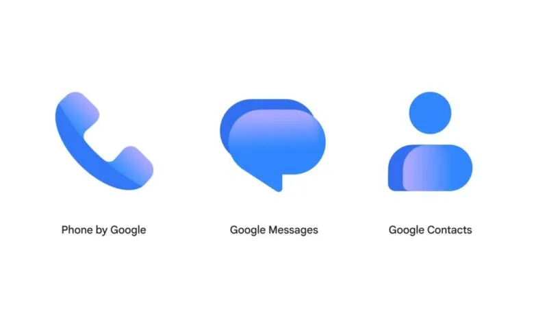
Google updates Contacts, Messages, and Phone icons with gradient design
▼ Summary
– Google is updating the visual icons for its Contacts, Messages, and Phone apps to feature sharper gradients and clearer edges.
– The redesign maintains the original app shapes while introducing updated curvature and coloring for better visual cohesion with other Google services.
– This icon update is being distributed gradually through the Play Store over the coming weeks and has already appeared in the latest Google Messages beta.
– The company explicitly states that there are no functional changes associated with this visual refresh, ensuring user experience remains consistent.
– The new icon designs will also be reflected on the web versions of the services at contacts.google.com and messages.google.com/web.
Google is refreshing the visual identity of its core communication tools, introducing a new gradient design for the Contacts, Messages, and Phone icons. This update follows similar redesigns applied to Workspace and Pixel applications earlier in the year, aiming to create a more unified aesthetic across the company’s software ecosystem.
The tech giant describes the new visuals as “sharper and clearer” on home screens, attributing this improvement to a “subtle but crisp gradient with easily readable edges.” While the fundamental silhouettes of the apps remain intact, the redesign incorporates “updated curvature and coloring to align with the rest of the Google apps you know and love.” This shift ensures that the icons feel cohesive with the broader suite of services users interact with daily.
The rollout will occur gradually over the next few weeks through the Play Store. Users may notice the change immediately if they are testing the latest Google Messages beta, which already features the updated iconography. Despite the visual overhaul, Google stresses that there are no functional changes associated with this update. The experience remains identical; only the appearance is being refined.
Users can expect to see these sleeker, more consistent icons appear on their devices soon. Additionally, the new design language is being implemented on the web versions of these services, meaning the refreshed look should also be visible on contacts.google.com and messages.google.com/web.
(Source: 9to5google.com)