Apple’s Liquid Glass Design: Revolutionary or Divisive?

▼ Summary
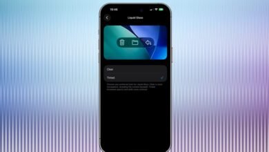
– Apple launched Liquid Glass globally as a new software design with a layered glass aesthetic and gloopy animations inspired by visionOS.
– The design received divisive feedback during its beta, with critics citing legibility issues, distracting visual effects, and inconsistent interface controls across devices.
– Apple’s approach blurs the line between interface and content, using large rounded corners that can chop off content and disregard conventional rectangular windows.
– Designers like Jonas Downey criticize Liquid Glass for being visually complex and overbearing, often prioritizing style over usability and focus.
– Ben McCarthy acknowledges the fluid animations as successful but points out that the glass effects cause distortions and legibility problems, increasing distraction.
Apple’s introduction of Liquid Glass at this year’s WWDC marks a bold new direction in software design, promising a visually immersive experience that dynamically interacts with both content and environment. Now rolling out globally, this aesthetic overhaul draws inspiration from visionOS and aims to unify Apple’s ecosystem under a single, fluid design language.
Early reactions have been sharply divided. While some applaud the ambition, many users report that the new interface often sacrifices clarity for style. On Mac, controls feel overly dominant, while on iPhone, they tend to vanish unexpectedly, making it difficult to build consistent interaction habits. The design leans heavily into transparency, animation, and rounded forms, sometimes at the expense of functionality.
Critics argue that Apple’s pursuit of harmony between hardware and software has, in practice, led to confusing visual hierarchies. Rounded corners on windows, reminiscent of the iPad, now appear across Mac and iPhone apps, sometimes cropping content awkwardly. The company’s own promotional imagery showcases a muted, monochromatic desktop where app icons blend into a sea of frosted glass, raising questions about practicality.
Designer Jonas Downey offers a measured critique, acknowledging the technical execution while questioning the overall benefit. “I appreciate flashy design,” he says, “but Liquid Glass often feels overbearing.” He points to issues like poor contrast, distracting translucency, and overly dimensional buttons that compete with, rather than complement, on-screen content. In his view, the new aesthetic lands in an uneasy middle ground between flat and skeuomorphic design, adding visual noise rather than reducing it.
Not all feedback is negative. Ben McCarthy, creator of Obscura Camera, praises the “Liquid” aspect of the design, the fluid, organic animations that echo the behavior of real materials. He highlights the success of features like Dynamic Island, which expands and contracts with a natural, ink-like quality. Where the concept stumbles, he suggests, is in the “Glass” element. The transparent layers can create visual distortions as content moves behind them, leading to readability issues. The system’s attempt to adapt by switching between light and dark modes can, ironically, become a distraction in itself.
What emerges is a tension between innovation and usability. Apple has clearly invested deeply in a unified vision, but whether that vision serves users, or simply imposes a new aesthetic, remains an open question. For now, Liquid Glass stands as one of the company’s most daring, and debated, software updates in years.
(Source: Wired)