Roku’s success strategy: embracing the uncool
▼ Summary
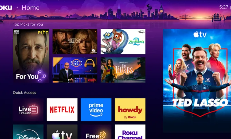
– Roku’s new homescreen refresh includes a small, personalized “top picks for you” section and a tight grid of tiles, differing from competitors’ large banners and autoplay trailers.
– Roku embraced cord-cutting and low costs from the start, targeting budget-conscious and non-tech-savvy users with affordable hardware and free, ad-supported TV.
– The new homescreen features a “quick access” section for frequently-used apps that auto-updates based on usage, designed to simplify the experience for less tech-savvy users.
– Roku lacks first-party data like Google or Amazon, using third-party data and LLMs to inform content recommendations, such as in the “Your Daily Scoop” section.
– Roku City, the cult-hit screensaver, now has its own app icon, and the company is exploring bringing it to mobile via its app to expand its reach and monetization.
Roughly a decade ago, a critic dismissed Roku as a company making “cheap hardware to sell to Walmart customers in flyover states.” The comment was intended as an insult, a jab at a business seemingly more focused on profit margins than on design or innovation. Yet, that remark has stuck with me over the years. As Roku crossed the milestone of 100 million households last month and cemented its dominance in streaming hardware, I’ve realized that its secret weapon might be its willingness to embrace the uncool.
Consider the new homescreen Roku began rolling out this week. It’s a long-overdue refresh, and in many ways, it represents the bare minimum the company could have done. That’s precisely why it’s likely to be a huge success.
Content-forward, but not overbearing
For years, streaming dongle and smart TV makers have championed content-forward user interfaces. The logic is straightforward: users don’t want to launch an app, scroll through endless rows of thumbnails, and repeat the process in another app just to find something to watch. Instead, these interfaces serve up personalized recommendations for movies and shows directly on the homescreen, with quick-access tiles for the next episodes of current favorites. The goal is to make watching TV faster and less about discovery.
Amazon pioneered this approach with Fire TV over a decade ago. Google followed with Android TV, then doubled down when it relaunched its platform as Google TV. Today, nearly every smart TV platform has adopted some form of content-forward design.
The sole holdout, until now, has been Roku. The company added a few content categories to its sidebar over the years but largely kept its homescreen as a simple grid of app icons. That’s changing this week, but in a distinctly Roku fashion. “I don’t think ours looks like those others,” says Preston Smalley, Roku’s VP of viewer product, who led the redesign. “Yes, it has content on it. Yes, it has a destination that you can browse, but I think it still stands apart as something unique.”
While competitors lead with massive, wall-to-wall hero art to highlight shows and ads, Roku’s new homescreen starts with a modest, personalized “top picks for you” section. Below that, rows of tiles resemble the old Roku layout: apps, destinations, and shows arranged in a tight grid, accompanied by a retractable sidebar and room for a large ad on the other side. Like its rivals, Roku aims to monetize its homescreen. The result feels predictable and familiar,perhaps even boring,but also less distracting than the bold interfaces of Fire TV and Google TV, with their autoplay trailers and massive banners. Existing Roku customers will feel right at home.
The logical conclusion of cord-cutting
Roku has consistently led a key trend: while some competitors tried to appease cable companies, Roku embraced cord-cutting from day one. The company also understood early on that cord-cutting was fundamentally about saving money. It priced its hardware accordingly, partnered with budget-friendly manufacturers like TCL to expand into smart TVs, and has heavily invested in free, ad-supported television for years.
Roku executives also predicted the logical endpoint of this trend: if all TV eventually streams, then everyone must be able to access streaming,including tens of millions of people who aren’t tech-savvy. Smalley knows this late-adopter world well. Before Roku, he spent nearly a decade at Comcast, where user research was an eye-opener. “I’d go to people’s homes,” he recalls. “Some people would have remote controls where they taped over the buttons and tried to simplify it down to what looks more like a Roku remote.”
Those attempts to simplify devices continue in the streaming era. “You’ve got people that maybe only use a few apps. Maybe their son comes by and configures it so that all their apps are right there. Unfortunately, not everyone’s got a loving son. For each of those, there’s 10 more that don’t have that.”
That’s why the new Roku homescreen includes a dedicated “quick access” section of frequently used apps above the fold. The section auto-updates based on usage and can even include a tile to switch HDMI ports for those who frequently toggle to a game console. “You have different people that are looking for different things,” Smalley says. “And yet you want to have one experience that works [for everyone].”
Roku City may be coming to mobile
One notable feature of the new homescreen is Your Daily Scoop, a section designed to serve up zeitgeist-influenced viewing recommendations. Think awards, holidays, pop culture moments, and even news,with some guardrails. “We’re not going to talk about the war,” Smalley says. “It’s definitely a curated experience.”
Still, the system runs largely on autopilot, so slip-ups are possible. More importantly, the feature highlights a weakness for Roku: a lack of first-party data that doesn’t originate from device usage. Google uses search trends to inform its Google TV recommendations, and Amazon can tap into Alexa usage patterns for Fire TV. Roku lacks those advantages and is trying to compensate with third-party data. “We’re using some of the LLMs [to figure out] what people are looking for,” Smalley says.
But Roku also has assets the competition lacks. One example is Roku City, its screensaver that became a cult hit during the pandemic. The new homescreen now includes a dedicated app icon for it. “We wanted to provide a way for [people] to launch it [without having to] wait 10 minutes before this thing comes on,” Smalley explains.
It’s a small step, but it aligns with Roku’s efforts to turn Roku City into both a destination and a revenue generator. In recent years, it has integrated ad campaigns, minigames, and even a live concert into the purple-tinged cityscape. Next up could be an expansion to mobile. “We have 34 million people using our mobile app every month,” Smalley says. “We’re looking at the right way to bring some of Roku City to mobile.”
If and when that happens, it will likely be deceptively simple,and incredibly successful.
(Source: The Verge)