AI Is Making Serif Fonts Obsolete
▼ Summary
– Public backlash against AI has led to a search for telltale signs of its use, with em dashes, the “rule of threes,” and constructions like “not X, but Y” being identified as giveaways.
– Serif typefaces are increasingly used by AI companies like Anthropic, Runway, and Perplexity to project “personality and warmth,” a trend called the “serif renaissance.”
– Designer Keya Vadgama says serifs, with their calligraphic origins, help AI companies signal humanity and build user trust, as AI is perceived as “cold and without opinion.”
– Serifs carry connotations of authority and scholarship, exemplified by Times New Roman’s use in the Encyclopedia Britannica and books, which can foster confidence in users.
– Critics have labeled the serif trend in AI aesthetics as “tasteslop,” “generic,” and “very ugly,” viewing it as a superficial attempt to counter AI’s lack of soul.
As resistance to artificial intelligence grows louder in public discourse, the hunt for unmistakable markers of AI-generated content has become something of a cultural obsession. One early casualty, much to my personal disappointment, was the em dash,an elegant, unmistakably human punctuation mark. Then came the dreaded “rule of threes,” a rhythm that aims for musicality but often lands with a thud of predictability. And who could forget the awkward “not X, but Y” constructions that litter AI prose like grammatical breadcrumbs?
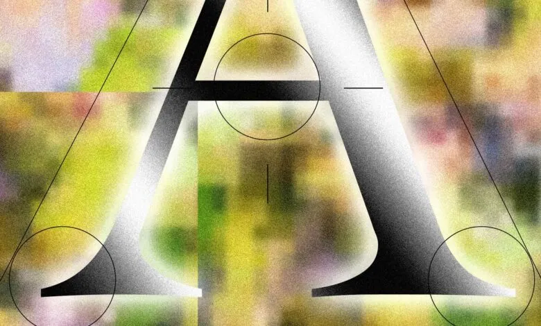
Now, typography itself is becoming a battleground in the fight to identify and reject AI influence. Specifically, serif fonts,those with small decorative strokes at the ends of letters,are increasingly associated with AI products and the design patterns that accompany them. This phenomenon, dubbed “tasteslop” by critics, describes the attempt to give generative AI designs a veneer of sophistication or distinction, often with clumsy results.
Keya Vadgama, a Bay Area writer, designer, and type expert, calls this shift “the serif renaissance.” In a recent newsletter on Substack, she argues that companies are turning to serifs to project “personality and warmth” in an otherwise cold digital landscape. “It’s not that difficult to discern why AI-native companies in particular are being drawn to serif fonts,” Vadgama writes. “AI is inherently cold and without opinion. [Using serifs] signals ‘We’re AI! But real humans use (and made) our product! We swear!’”
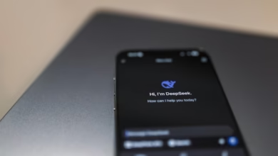
Vadgama points to Anthropic’s Claude as a prominent example, noting that the AI assistant defaults to serif typefaces. Other AI companies,Runway, Perplexity, and Manus,have followed suit in their user interfaces and branding. When asked about this choice, Perplexity’s chief communications officer Jesse Dwyer offered a straightforward defense: “Why wouldn’t we have human design? Perplexity is for people.”
The appeal of serifs goes beyond mere aesthetics. Vadgama believes these fonts play a crucial role in building trust between users and brands. Serifs evoke a sense of history and dignity, while sans serifs like Arial, Calibri, and Helvetica feel too clean, too machine-like. Times New Roman, in particular, carries a weight of authority that can reassure nervous users. Vadgama recalls working with a now-defunct AI startup that insisted on serif branding. “A big part of it,” she says, “is, ‘How do we position ourselves in a way that people are not afraid of us?’”
That authority is no accident. Times New Roman was commissioned in the 1930s by Britain’s The Times newspaper, and it became the standard for books, newspapers, and reference works for decades. The Encyclopedia Britannica, arguably the preeminent compendium of human knowledge before the internet, was set in Times. “In the broad public, a serif carries connotations of scholarship,” says Ali S. Qadeer, chair of graphic design at the Ontario College of Art and Design in Toronto. He notes that Claude’s interface, with its slightly brown background mimicking a book page, is “sort of emulating the feeling of reading print. And print has deeper associations with trust.”
Even the U. S. State Department has returned to Times New Roman, according to The New York Times, after Secretary of State Marco Rubio criticized Calibri as “informal” and linked its adoption to Biden-era DEI initiatives.
Both Qadeer and Vadgama see the serif trend as a response to AI’s perceived lack of soul and the public’s growing suspicion of the technology. But not everyone is convinced. Online critics have derided the “serification” of AI aesthetics as “generic” and “very ugly,” adding to the ongoing debate about what truly makes design feel human.
(Source: Wired)