Microsoft’s Rejected Office Icons Revealed
▼ Summary
– Microsoft is revealing design concepts it experimented with before finalizing new Office icons, some of which differ significantly from the final versions.
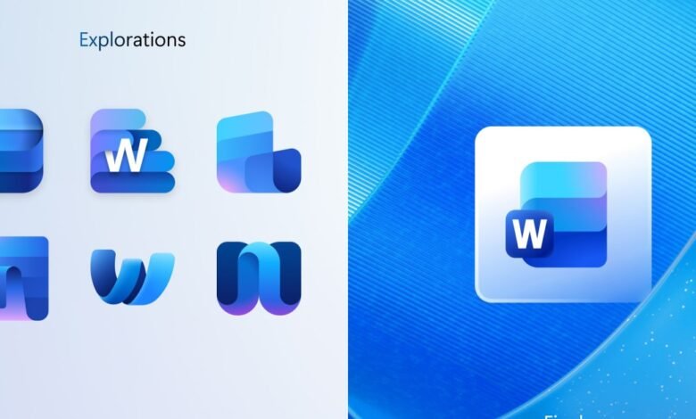
– For Word, Microsoft tested icons resembling notepads, stacks of paper, and variations with and without lettering, settling on a design with three horizontal bars.
– Excel concept icons heavily featured cells, with one standout X design, but most concepts were similar to the final icon.
– PowerPoint concepts included letter-focused designs like a ribbon-like P and a P with a pie chart, but the final icon is a more rounded, colorful update.
– The new Office icons are rolling out on Windows and iOS, with Windows using lettered versions and iOS using icons without letters.
Microsoft has begun introducing a fresh set of curved, vibrant icons for its Office suite, and recently unveiled several design concepts that were considered before the final versions were chosen. These early explorations for Word, Excel, and PowerPoint show ideas that sometimes echo the aesthetic of older Office for Mac designs, offering a fascinating glimpse into the creative process behind the new look.
The Word concept icons experimented with a range of visual approaches. Some designs mimicked a notepad, while others played with stacks of paper or documents. In certain versions, the “W” lettering took center stage; in others, it blended subtly into the background or was removed entirely. Ultimately, Microsoft selected a design featuring three horizontal bars, one fewer than in previous versions, and is now using variations both with and without the “W” lettering.
For Excel, the design team explored numerous concepts that heavily emphasized the idea of cells, a core element of the spreadsheet application. While most proposals stayed close to this theme, one standout concept featured a bold “X” icon. Despite these creative explorations, the final Excel icon remains quite similar to the cell-based designs Microsoft has traditionally used.
PowerPoint’s identity has always revolved around slides, and the concept icons tested different ways to represent this. A few designs focused on the letter “P,” transforming it into a ribbon-like shape or combining it with a pie chart. However, the final PowerPoint icon is more restrained, offering a slightly more rounded and colorful update to the current design rather than a radical departure.
Alongside these core applications, new icons for Teams, OneDrive, Outlook, and OneNote are also being rolled out across Windows and iOS platforms. Interestingly, Microsoft is using the lettered versions of the icons on Windows, while the iOS versions omit the letters entirely. This strategic difference highlights how the company tailors its visual identity to fit different operating systems and user expectations.
(Source: The Verge)


