Your iPhone’s Next Big Update Is Here

▼ Summary
– iOS 26 introduces a new design language called “Liquid Glass,” giving many iPhone elements a glassy sheen and new visual effects.
– The update includes features like glass-like app icons, magnifying text bulbs, translucent navigation elements, and light-reactive buttons.
– This design represents a shift from the flat aesthetic of previous iOS versions and may feel jarring initially, requiring an adjustment period.
– Apple has refined Liquid Glass through beta testing and plans further tweaks based on user feedback after the official release.
– Despite the visual overhaul, iOS 26 maintains the same core functionality as previous versions, and Apple is committed to rolling out Liquid Glass across its product line.
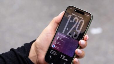
Apple’s newest iPhone software, iOS 26, has officially launched, introducing a striking visual overhaul that reimagines the look and feel of the device. Dubbed “Liquid Glass” by Apple, this design philosophy brings a glossy, three-dimensional quality to nearly every element of the interface. App icons now appear as if carved from polished glass, while text magnification features a smooth, lens-like bubble effect. Even Safari’s navigation bar and notifications take on a translucent, floating appearance, with subtle lighting shifts on the app dock and Control Center based on how the phone is held.
The overall impression is unmistakably Apple, bold, polished, and instantly pervasive. Yet for many users, the shift may feel abrupt. Since the flat aesthetic of iOS 7, iPhones have largely avoided dimensional styling. Liquid Glass reintroduces texture and depth, which can be visually impressive but requires some adjustment in daily use.
Early beta versions faced significant readability challenges, but Apple has refined the experience through months of testing. Now that the update is widely available, further refinements are likely based on user feedback. Having used Liquid Glass as my primary interface since its announcement, I’ve grown accustomed to the new look. While the visual language is dramatically different, the underlying functionality remains familiar. Core operations and interactions haven’t changed, it’s still the iOS you know, just dressed in glass.
I expect mixed reactions, with some users embracing the fresh aesthetic and others less enthusiastic. Apple has already shown a willingness to iterate, as seen throughout the beta cycle, and will likely continue adjusting details. But the company’s commitment to Liquid Glass is clear, it’s rolling out across other Apple products as well. Whether you love it or not, this design direction is here to stay, and users will adapt over time.
(Source: The Verge)