Google Phone App Gets a Fresh Material 3 Bottom Bar
▼ Summary
– Google Phone app has updated to fully comply with Material 3 Expressive design by shortening its bottom navigation bar.
– The change arrived in stable version 204, reducing padding and tweaking text labels for the Home, Keypad, and Voicemail tabs.
– This is a server-side update that users can prompt by force-stopping the app from its App info settings.
– The update prioritizes design consistency with other Google apps, like Google Home, rather than significant space savings.
– Some features, like the “Keep portrait mode” setting, remain unavailable, and the Expressive Calling feature is still in beta.
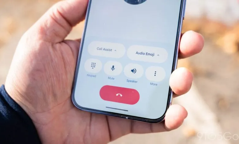
The Google Phone app has received a subtle yet significant visual refresh, bringing its navigation bar fully in line with the latest Material 3 design language. This update shrinks the bottom navigation bar, creating a more modern and cohesive look that aligns with other core Google applications. The change emphasizes a cleaner interface, though the functional layout of tabs for Home, Keypad, and Voicemail remains unchanged.
With the rollout of stable version 204, users will notice the app now features a shorter navigation bar. The most visible adjustment is the reduced padding above the pill-shaped tab indicator, giving the component a more compact appearance. Google has also made minor refinements to the text labels beneath each icon. It’s important to note this is a server-side update; if you don’t see the change immediately, you can try forcing the app to stop from your device’s App info settings.
The visual difference is particularly noticeable when using the app’s dark theme. In practical terms, the actual screen space reclaimed is minimal. This update is primarily about design consistency across Google’s ecosystem. The Google Home app received a similar navigation bar adjustment last month. Currently, Google Photos remains a notable exception to this widespread design shift, alongside a few other services like Google Fi and Voice.
This refinement follows the app’s initial adoption of the Material 3 “Expressive” design system last year, which at the time left the bottom bar taller than other updated elements. The latest tweak completes that visual transition. Separately, Google continues to develop other features for the Phone app. The “Keep portrait mode” setting has not yet made a widespread return for users, and the Expressive Calling feature remains in a beta testing phase.
(Source: 9to5 Google)