The Unbearable Monotony of Liquid Glass
▼ Summary
– Liquid Glass is Apple’s new design system that creates three-dimensional, glass-like interfaces with buttons and menus that change color and refract light.
– The system has improved in beta testing with better legibility and battery performance, though it still has issues like battery drain on some devices.
– It is criticized as an ill-fitting universal design that feels cluttered on key devices like the iPhone and Apple Watch, where it hinders usability and readability.
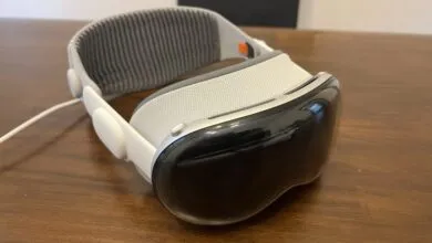
– Liquid Glass works better on devices like the Vision Pro and Mac, where three-dimensionality or minimal system interface aligns with the hardware’s purpose.
– The design represents Apple’s broader shift toward device convergence and a future-focused AR/VR vision, but it currently clashes with the diverse needs of existing screens.
Liquid Glass represents Apple’s ambitious new design system, aiming to bring a unified three-dimensional interface across its entire product ecosystem. This approach layers buttons and menus over content, simulating the look and feel of real glass with dynamic color shifts and light refraction. While visually striking and technically polished, the system raises questions about whether a one-size-fits-all visual language truly serves every device equally well.
Having tested various beta versions across multiple Apple products over recent months, I’ve observed noticeable improvements in usability. Early issues like excessive translucency have been addressed with more frosted, readable menus. Battery drain on newer iPhone models, though still a concern, appears to be gradually improving. On the surface, Liquid Glass functions as intended, it’s sleek, modern, and undeniably impressive from a technical standpoint.
The core issue, however, lies in its fundamental premise. Apple seems determined to enforce a single design metaphor everywhere, from the Apple Watch to the Vision Pro. While the idea of depth and physicality sounds appealing, in practice it often introduces visual clutter rather than clarity. This is especially evident on the iPhone, where full-screen apps and constant interaction with system interfaces make the layered, shifting elements feel intrusive rather than integrated.
This push toward uniformity is part of a broader trend within Apple, blurring the lines between devices in an effort to create a seamless experience. Features like a full Phone app on Mac or iPadOS adopting more desktop-like window management are rolling out alongside Liquid Glass. Many of these additions are useful, but they mark a significant departure from Apple’s longstanding philosophy of tailoring software to specific hardware strengths.
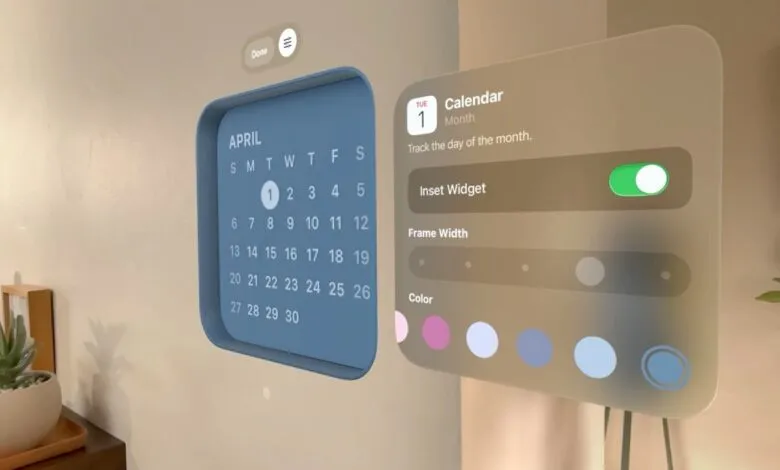
Where Liquid Glass succeeds, it does so convincingly. On the Vision Pro, the three-dimensional effect feels natural, digital objects coexist with physical space, reducing the need for traditional app switching. On the Mac, where users exercise more control over window placement and UI elements, the transparency and refraction are subtler and less disruptive.
But on the iPhone, the system struggles. Constant transitions between home screens, Control Center, and notifications make the ever-shifting glass-like elements more distracting than immersive. Instead of blending digital and physical, it often just feels like one screen fighting for attention over another. Even in Apple’s own promotional images, menus can appear muddled and icons lose distinction against varied backgrounds.
Practical usability issues persist. Colorful webpages in Safari can render search bars nearly invisible. Busy wallpapers turn notifications into visual chaos. Many users, myself included, have resorted to plain dark backgrounds just to make the interface tolerable. On the Apple Watch, where glanceability is critical, Liquid Glass’s insistence on blending time with background imagery defeats the purpose of quick, clear information delivery.
Apple’s long-term vision is clear: a future where augmented and virtual reality dominate, and digital interfaces feel as tangible as physical objects. In that context, Liquid Glass could prove visionary. But for now, we live in a world of diverse screens, each with distinct purposes. Apple once excelled at crafting software that felt native to each device, iOS 7’s shift toward a purely digital aesthetic was a masterclass in functional design. It acknowledged that screens are screens, not windows into alternate realities.
Today, the company seems to be chasing a sci-fi ideal that prioritizes style over situational practicality. There’s no physical world behind my iPhone display, I don’t need simulated refraction or depth. I need clarity, responsiveness, and simplicity. Sometimes, a button should just look like a button.
(Source: The Verge)