Microsoft’s Office Gets a Colorful, Curvy Redesign
▼ Summary
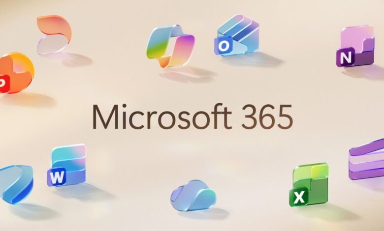
– Microsoft is officially launching new Office icons today, featuring a modern, colorful, and playful design inspired by Fluent illustrations.
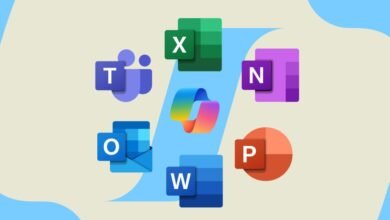
– All 10 core Office icons are being updated for the first time since 2018, reflecting a more connected design system and Copilot’s influence.
– The new icons use richer, more vibrant gradients with exaggerated analogous transitions to improve contrast and accessibility.
– Icons are simplified with softer, fluid forms and fewer elements, such as the Word icon reducing from four to three bars for better legibility.
– The updated icons will roll out in the coming weeks across web, desktop, and mobile for Microsoft 365 users.
Microsoft has officially launched a vibrant new set of icons for its core Office applications, marking the first significant visual update since 2018. This redesign introduces richer gradients and softer curves, aligning the icons with the company’s broader Fluent design system and reflecting the growing influence of Copilot across Microsoft 365. The refresh aims to convey a more connected, intuitive, and accessible experience for users.
The makeover affects all ten primary Office apps, drawing inspiration from the aesthetic established by the Copilot icon. Jon Friedman, corporate vice president of design and research for Microsoft 365, notes that while the 2018 update emphasized connection and collaboration, the new icons push further into fluidity and simplicity. He describes them as projecting a sense of motion and approachability, moving away from the static, solid forms of the past.
Color plays a central role in the new look. Gradients are now more pronounced and vibrant, using analogous color transitions that enhance both visual appeal and accessibility. This shift mirrors recent trends in digital branding, similar to Google’s own logo evolution, focusing on dynamic color that stands out across various devices and screen sizes.
Simplification is another key element. For instance, the Word icon previously displayed four horizontal bars but now features just three, improving readability at smaller scales. Friedman explains that sharp edges and rigid lines have been replaced by smooth folds and curves, giving the suite a more playful and modern character. These design choices are intentional, aiming to make the applications feel more inviting and easier to recognize at a glance.
The updated icons will gradually appear over the coming weeks for all Microsoft 365 users, whether they access the apps on the web, desktop, or mobile. Both individual consumers and commercial clients will see the new look, reinforcing Microsoft’s commitment to a cohesive and contemporary visual identity across its productivity tools.
(Source: The Verge)